00:00
00:00
Luis
Interesting blurb

Server spiller

Moms house

Joined on 4/23/00

Level:
11
Exp Points:
1,212 / 1,350
Exp Rank:
53,605
Vote Power:
5.31 votes
Audio Scouts
3
Art Scouts
10+
Rank:
Civilian
Global Rank:
> 100,000
Blams:
17
Saves:
32
B/P Bonus:
0%
Whistle:
Normal
Trophies:
120
Medals:
830
Supporter:
9y 2m 22d
Gear:
49

Typography Matters

Posted by Luis - March 6th, 2008


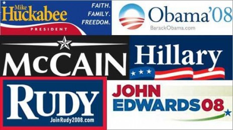
Those who know me well (maybe even those who dont) know I'm close to being obsessed over typography.. I'm not quite sure who to blame for that but I just love type. At any rate, I was doing my usual internet wanderings and I ran accross an interesting article in the Boston Globe regarding the typography in presidential candidates campaigns. Its a good read, i dont agree with all the points the authors make but its still amazing the everpresent power of type.

Speaking of which, its somewhat of a lost art to see really good typography and titling in flash animations/game menus these days. Dont know if everyones just too pressed for time or our font pools are way malnourished.. whatever the case its a shot in the foot to spend so much time on your stuff only to use a really mediocre menu or type treatment!

Anyone know of things on the portal that have had particularly beautiful typography?

Here are some of my favorites that i could think of:

Russian Mafia on Mars - The menu is very subtle which is kind of refreshing.. the sharp angles of how the type is placed make slight references to russian constructivist posters of the 1930's. The typography is crisp and clean just like Kol's artwork.

Sounds of Thunder - I liked how the credits are handled in an interesting way.. it provides visual interest to an otherwise non-animated scene. The russian type in the title is also tastefully done.

Se7en opening sequence - This isnt a flash movie obviously but i just thought I'd mention it because not always is clean typography appropriate.. sometimes very rough and organic type sets the mood better.. such is the case here. I like that double exposure technique and how the scenes are haphazard and 'sewn' together very akwardly.

If anyone can refer me to more that would be greaaaat.

==============================

Heres that article on typography and the presential candidates

(I'm not an Obama fan but I do love the typography of his campaign)

===============================

40 Free fonts that actually have good proportions (Except 'Delicious' i hate that one)

Typography Matters


1

Comments

A very interesting read indeed!

Are you into comic lettering, too? I love russian mafia on mars, probably one of my favorite NG toons of all time..

Typography is something I fail at. It's sad too, because it really can be beautiful.

Oh well, cocks.

Finally we find something in common.

Kevin '07
kevin Rudd for Prime minister

Ok I'll ask you for help on my next menu. It must be killing you that the review score type is still active on the site. Oh and I hope you didn't front page this, I was just perusing your profile.

I too love typography. Font design and whatnot. It's what sparked my love for graffiti. People finding unique ways to show letters we see in everyday life.

There used to be books on typography at the local bookstore but the art area's been flooded with "how to draw manga" books now.

Inturesting.. i never saw you as a typography type (lol). I saw you more as a shoot lobsters out your pisshole kind.

One thing I dont understand about the American presidential elections is why no third party parties are never heard of.

What's Typography???

Typography certaintly is a art of its own. I definitely have to agree with the choices you mentioned and surrounds us everday fashions such as reconizing the signs of the fast food subway and the occansional "STOP" sign.

So how can we seamless and successfully combine type to an animation?

Heck, I always admire how clean and clear your typography in your menus have been... or it could just been the illusion of the shadows, ha.

One that stands out is the ending sequence to Almightyhans's CLATOMIC series. It really expresses that comic-esque notion and in many ways is similar to his love for the 1940's era films, with the very obscure angle typography expressed in earlier films.

you meant something like that yeah with kevin rudd thingy yeah?

I was using StumbleUpon and found some neat typography stuff.

<a href="http://www.shinybinary.com/">http://www.shinybinary.com/</a>

By the way, what's the name of the song in Pass My Flash 2?

Its inside the toon... just wait for the credits to scroll through on the front menu.

what have you been up to lately

yeah Gotham's a sweet font, Obama's campaign is the only one I really think has nice typography though...

youre a sweet font my princess

Make a picture of what you want the review scores to look like, and post it in the Art Portal.

actually they've grown on me. I'd say just take off the gradient. thats about it at this point <3

Nothing on the site has a gradient except that and it looks akward. Even the buttons arent gradients but bevels....

Cool. I'm an Obama supporter too!

I always liked your opinions on typefaces, it's something i started appreciating too late. Recommend me some good fonts.

p.s. i never liked that bank gothic one you sent me that you always used

hmm.. my favorite typefaces are:

Georgia - this is one of the rare built in fonts that looks good and has old style numbers on it. Most times you have to pay for fonts that have those. Another plus is that it looks good online in html for like headlines and shit. I think it looks better than Times Roman

Helvetica - Lame for me to say that but if you can get the commercial version with all its variations its probably the most useful font youll ever have.

Alien League - This one looks nice when you have it spaced out. The uppercase A with no midstem is distinctive and the proportions are comfortable

The Mix - This is a pretty good font.. it has a nice variety of weights and its like a cross breed of sans-serif with some letters having a touch of slab on them. This font has small caps which are useful

I link out to a site that has professional grade fonts that are free up above

i like obamas and john edwards.

ps: your new profile pic pwns